I focused on how we could filter and provide recommendations based on what users want to see because the trick to providing readers engaging readers with the content they want is by having them tell you what they want to see. This meant I needed to work on either creating features for users to get more specific with their searches or give users the power to tell Webtoon exactly what they do or do not want.

8 low-fidelity sketch ideas containing different potentiial solutions.


The idea I decided to go with in the end. This solution is focused on improving Webtoon previews and interaction with the Recommendations section.
The runner-up solution resembled Tapas, another popular webcomic hosting platform.
After choosing a direction, I set out to more explicitly define design goals and success criteria:

Users will value the personalization in recommendations from the settings in the status bar.

Adding the pop-up window for Webtoon previews will make users feel like there are less steps in the process of browsing webcomics.

Users will find buttons like “Show me more like this” or “Do not show me more like this” helpful in their Webtoon recommendation process.
Storyboard
Our user’s journey began with a user looking for new Webtoons to read and ended with them finding the content they want to see with ease. Other important moments included:
1. the "i" and "three dot" buttons under the titles leading to a popup menu
2. users being able to like and dislike Webtoons, with that affecting Webtoon's recommendations for them
3. a cleaner Webtoon preview page, so users can find the information they want more easily


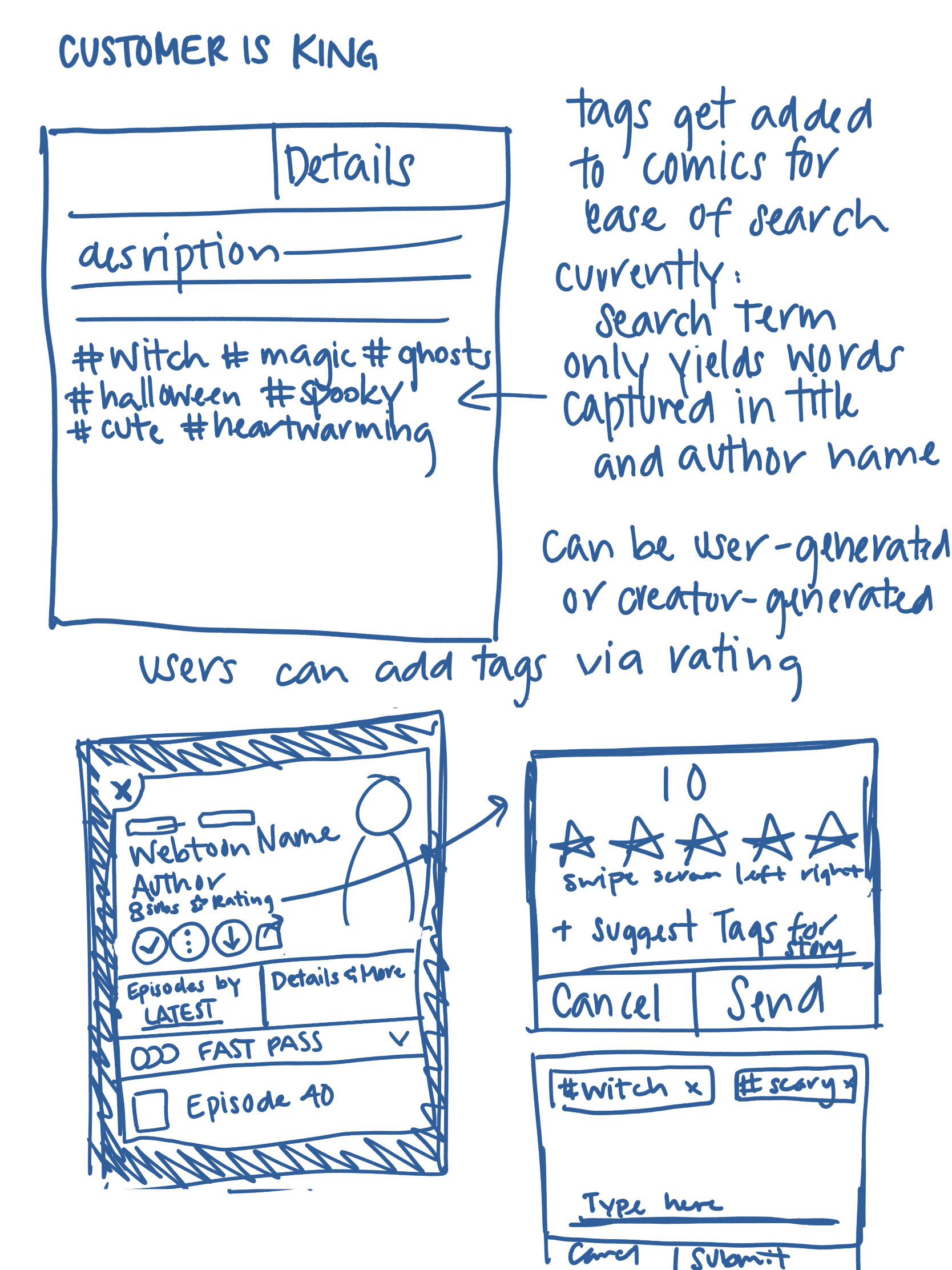
A sketch of the preview with the new, updated information layout.
The "i" and "three dot" icons and the popup menu connected to them.
Prototyping a
Successful Solution
Prototyping a
Successful Solution
Prototype
I generated a realistic prototype to bring my solution to life and get high-quality feedback from users with Figma. The prototype was carefully created to mimic Webtoon's current interface and to create more connections between Webtoon's features and capabilities that it did not already show.
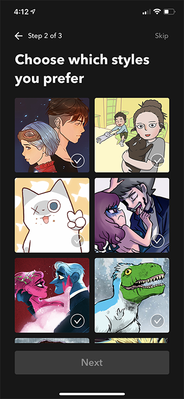
Webtoon's onboarding quiz determined what kinds of webcomics readers would receieve as recommendations. This quiz plays a key role in my prototype, as it behaves as a driving factor to direct Webtoon to providing the correct content to users. While keeping within the Webtoon design principles, I created a gateway for users to put the power to curate their webcomic feed into their own hands.
Try out my prototype here!This YouTube video presents a click-through of my Webtoon Figma Prototype, displaying all the screens created to bring this idea to life.


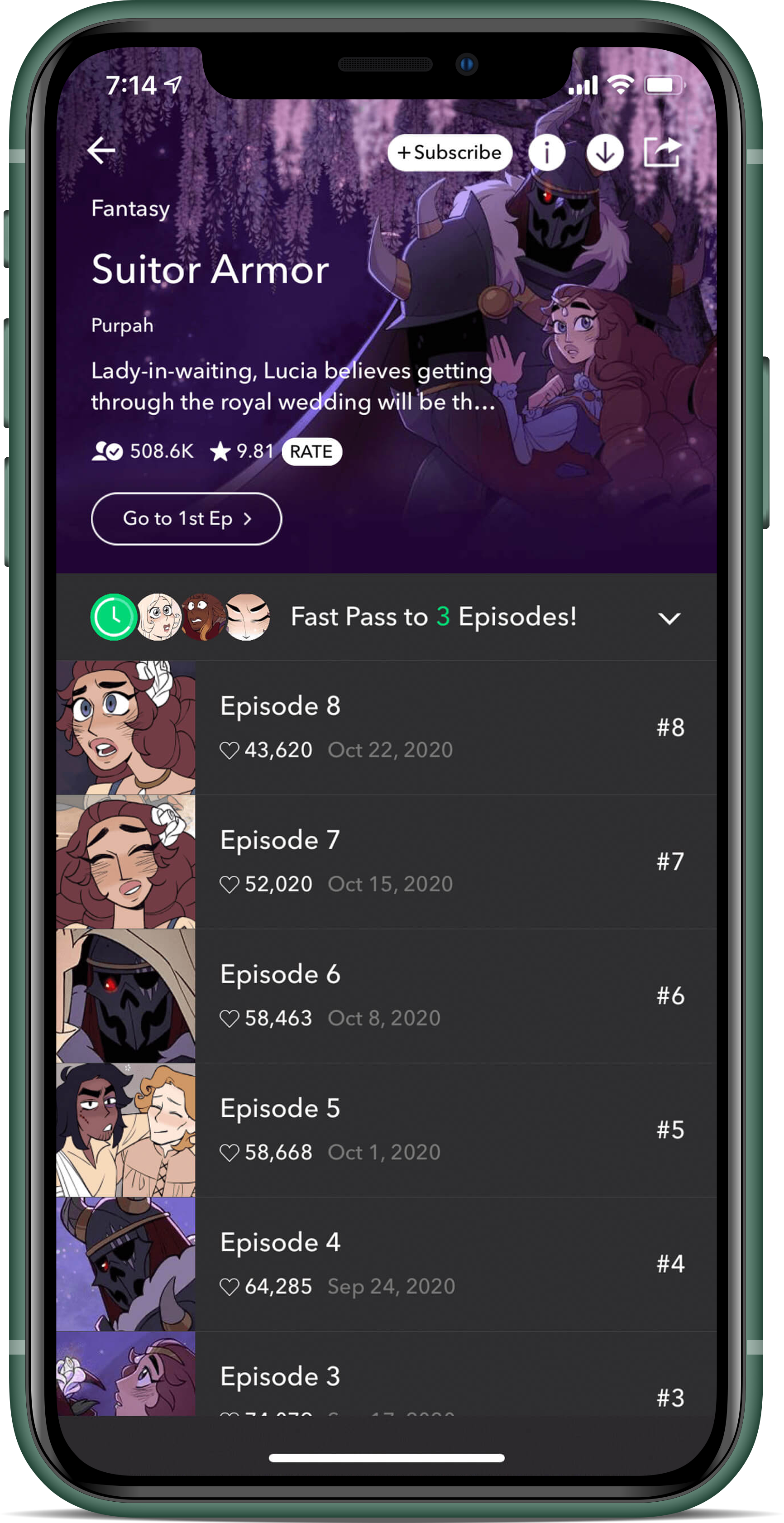
What changed: The "i" and "three dot" icons replace the author name and open up to popup menus that affect the user's interaction with the webcomic


What changed: Episodes and descriptions separated in two tabs, with interactive buttons put at the bottom left of the header for more visibility with different header images

A popup window that explains Webtoon's recommendations to the user.
Pressing the "Take the Quiz" takes the user to Webtoon's onboarding quiz to figure out what kind of content the user prefers.

Popup menu at the bottom displays options for users to interact with.
I identified target users through my personal contacts and assembled a research script to ensure I got high-quality & unbiased feedback. Interviews were about 45-60 minutes long via video call.
Each user was given the task of looking for a new Webtoon to read in the Recommendations tab. Users were free to explore the parts of the working prototype they pleased, and they all achieved the task with relative ease.
While the changes were subtle and not met with outright surprise or glee by users, one remarked that the layout felt familiar and made browsing webcomics easier. "I like what you've done with the preview page," Iris G., a frequent Webtoon reader, stated. "The changes definitely make it easier to take in all the information you need to read for the webcomic."
User Testing & Evaluating
Key Takeaways
After completing interviews, I revisited my notes to find large patterns and inform next steps.

Users did not highly value the windowed Webtoon preview page.

The concern of having the Webtoon on a window to feel like less of a commitment did not resonate with my users. No one really commented on it.

Users appreciated the ability to mold their recommendations into what they wanted to see.

The popup menu was a hit! 5/5 users understood each button and commented that it would make finding new recommended content easier.
I revised the popup window in my prototype after testing by resizing each window to page width.

Integrating the onboarding quiz Webtoon already has was a good idea.

None of my user testers knew Webtoon's "Find your Series" quiz existed, so integrating the quiz into my prototype enabled awareness of the quiz to users, and also provides a segue for Webtoon to use the quiz to its fullest potential -- to influence its recommendations to users.


