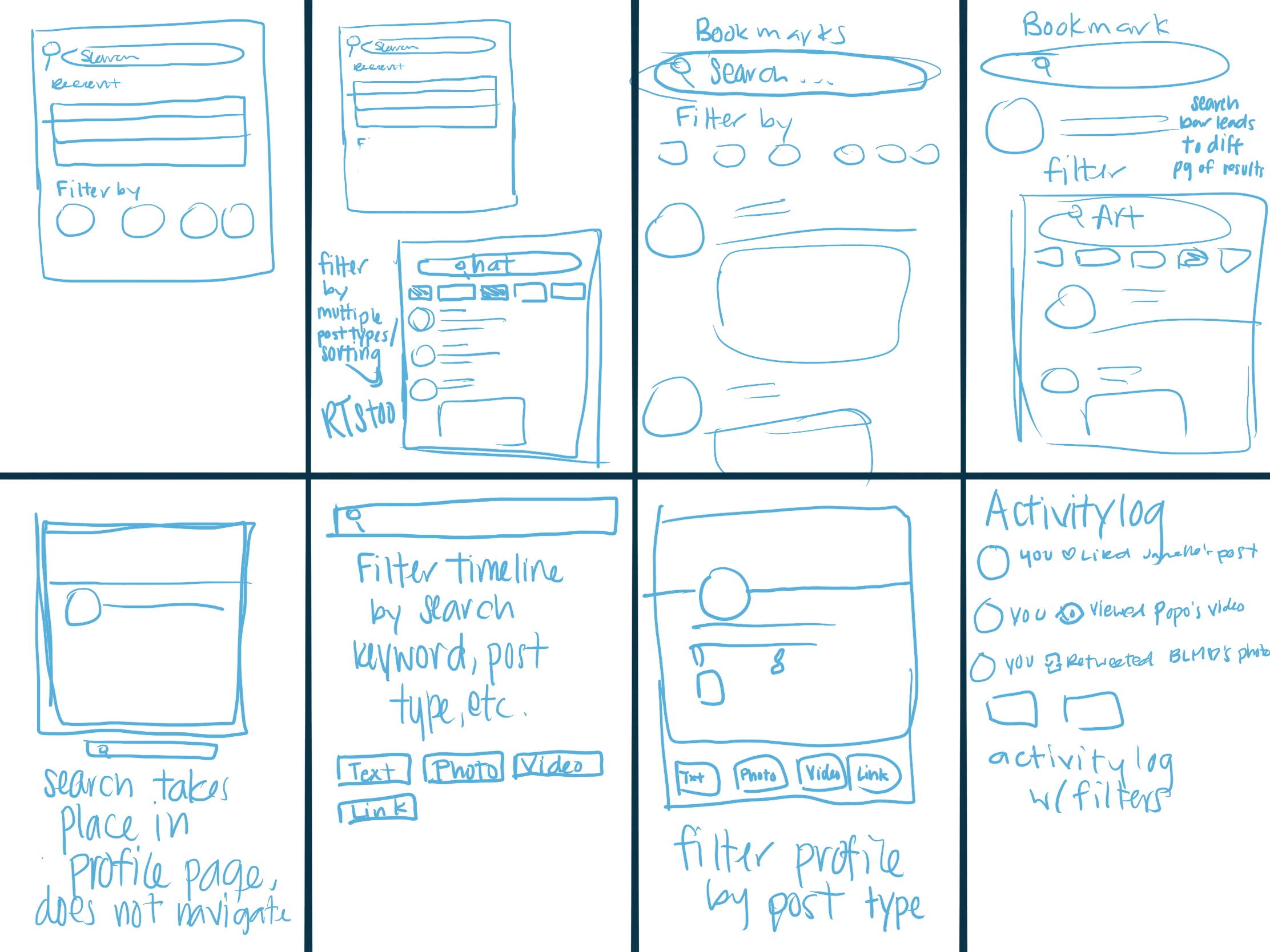
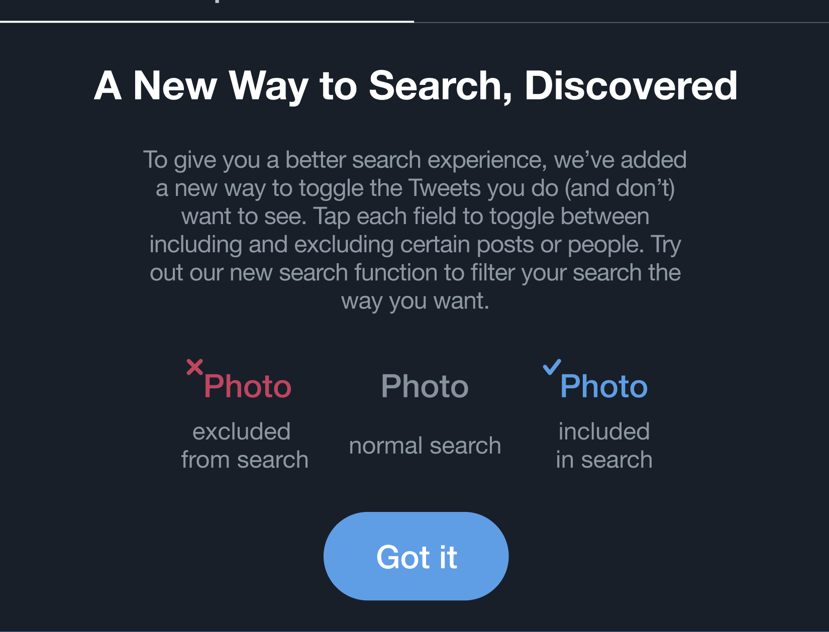
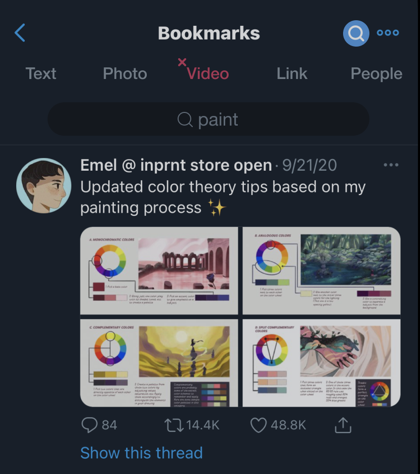
I focused on how we could make a smoother and faster search process because as stated above the map, I found that changing this feature would lead into different improvements that could be made across Twitter as a whole. This solution led me to sketching out how searching could be improved on different kinds of screens.

8 low-fidelity sketch ideas. I considered different screens for search options.


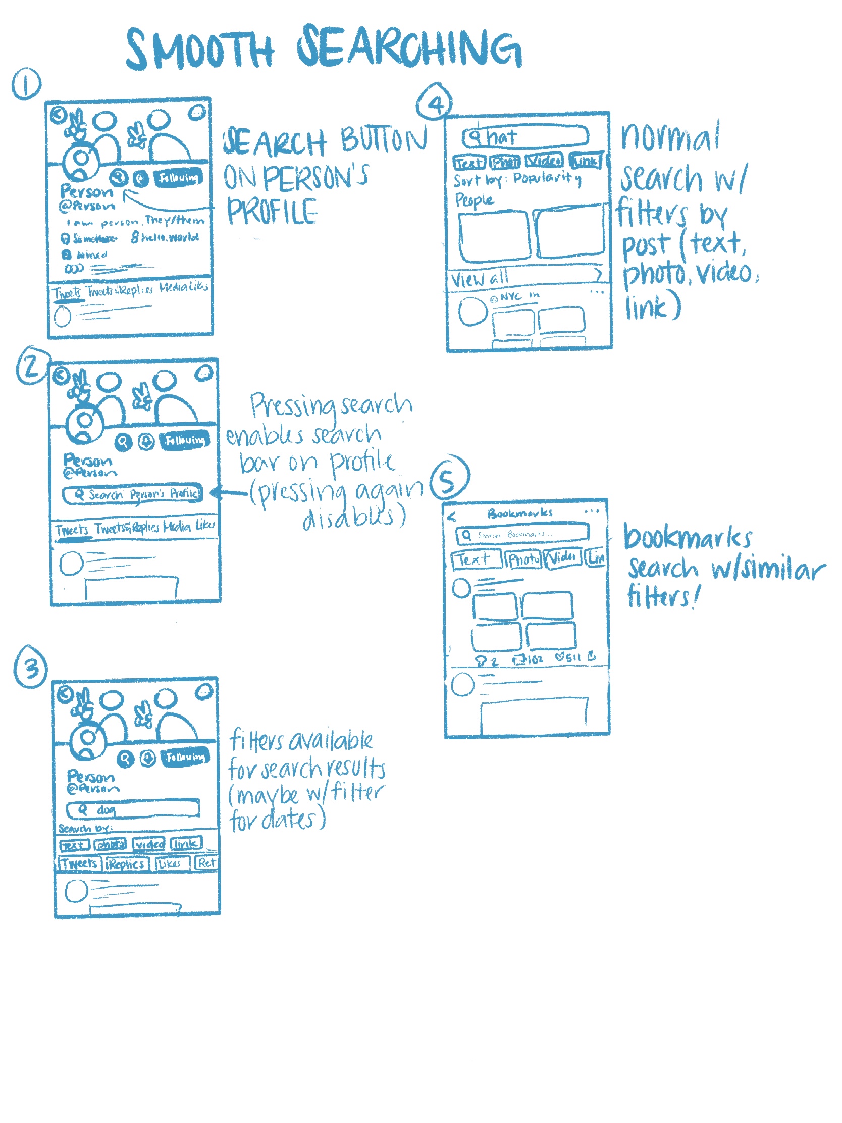
The idea I decided to go with in the end. I sketched out ideas for searching profiles and bookmarks along with the normal search option.
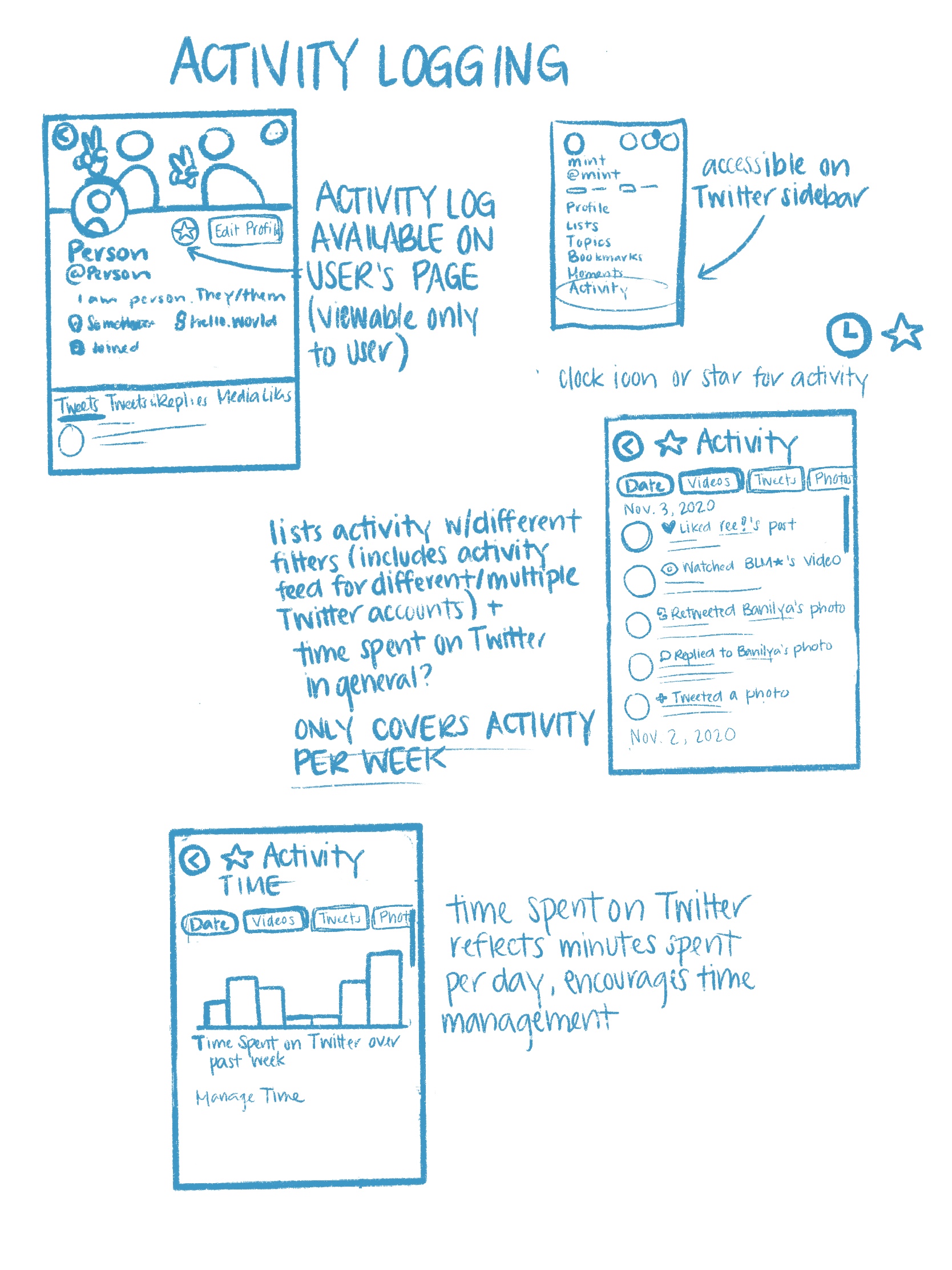
The runner-up solution resembled Facebook's and Instagram's activity logs.
After choosing a direction, I set out to more explicitly define design goals and success criteria:
By adding more search functionality on Twitter, users will have an easier time keeping track of Tweets they want to refer back to.

The search changes on different Twitter pages will fit in with Twitter’s current design and will not feel disruptive or out of place.

Users spend less time looking for Tweets they want to find with the additional search functionality.
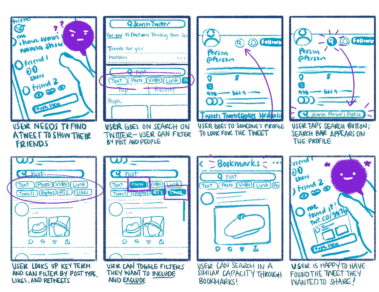
Storyboard
My user’s journey began with a user looking for a Tweet they wanted to show their friends and ended with them finding the content they want to share with ease. Other important moments included:
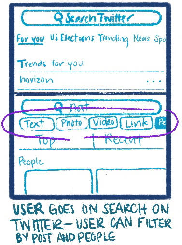
1. the search function featuring new buttons that can toggle different criteria (by post or people)
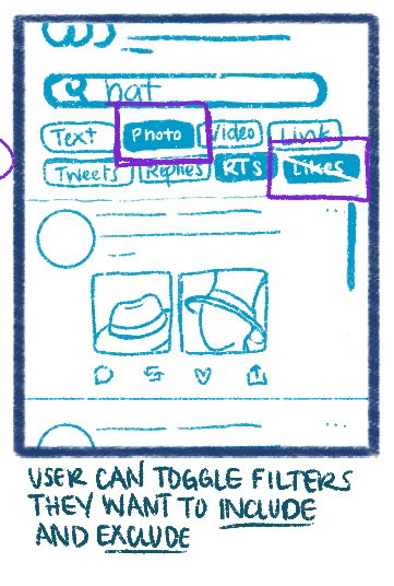
2. interactive buttons that can include and exclude certain posts


Highlight 1:
Search buttons that can help filter posts more easily than Advanced Search
Highlight 2:
Search filters include and exclude different types of posts to show
Prototyping a
Successful Solution
Prototyping a
Successful Solution
Prototype
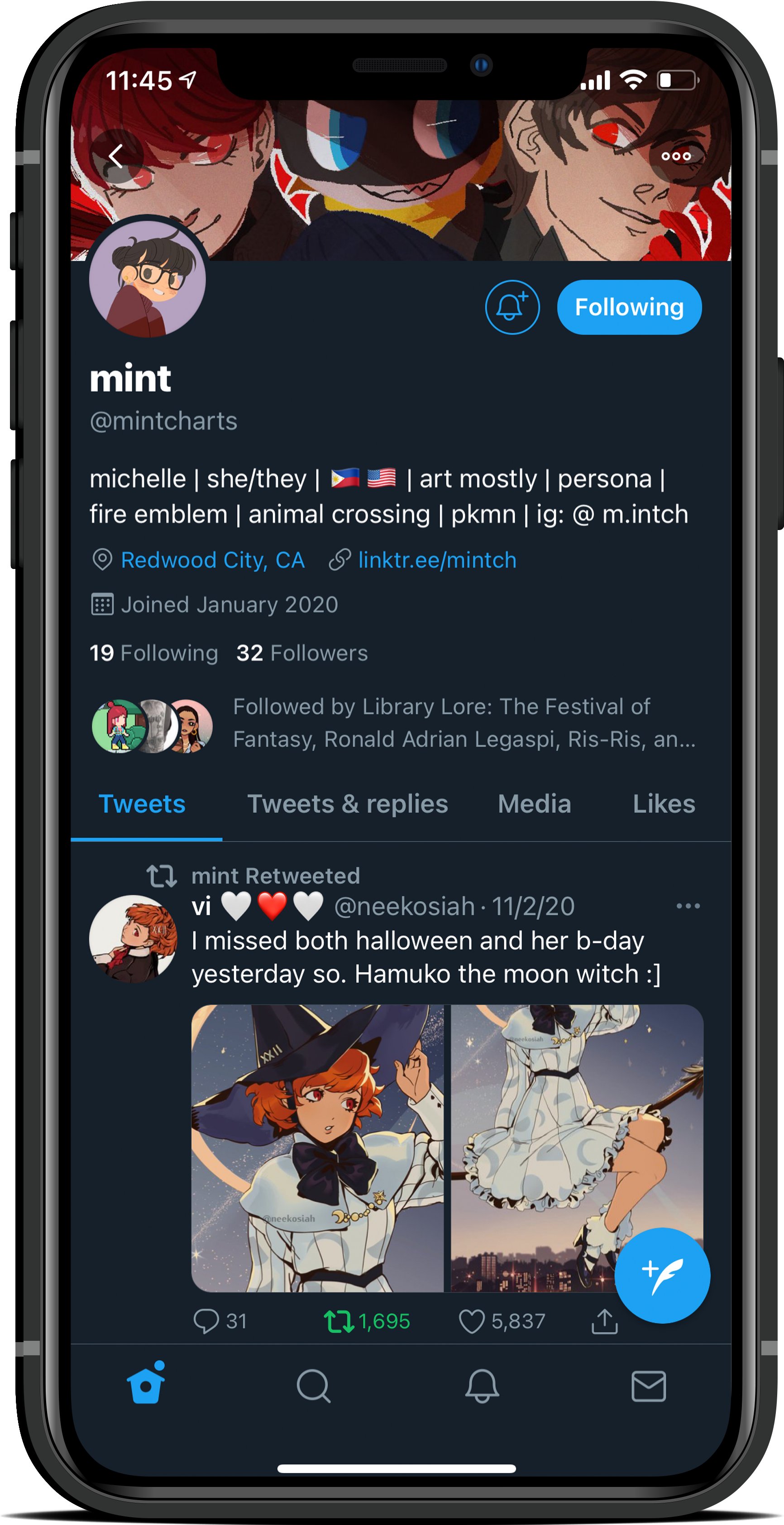
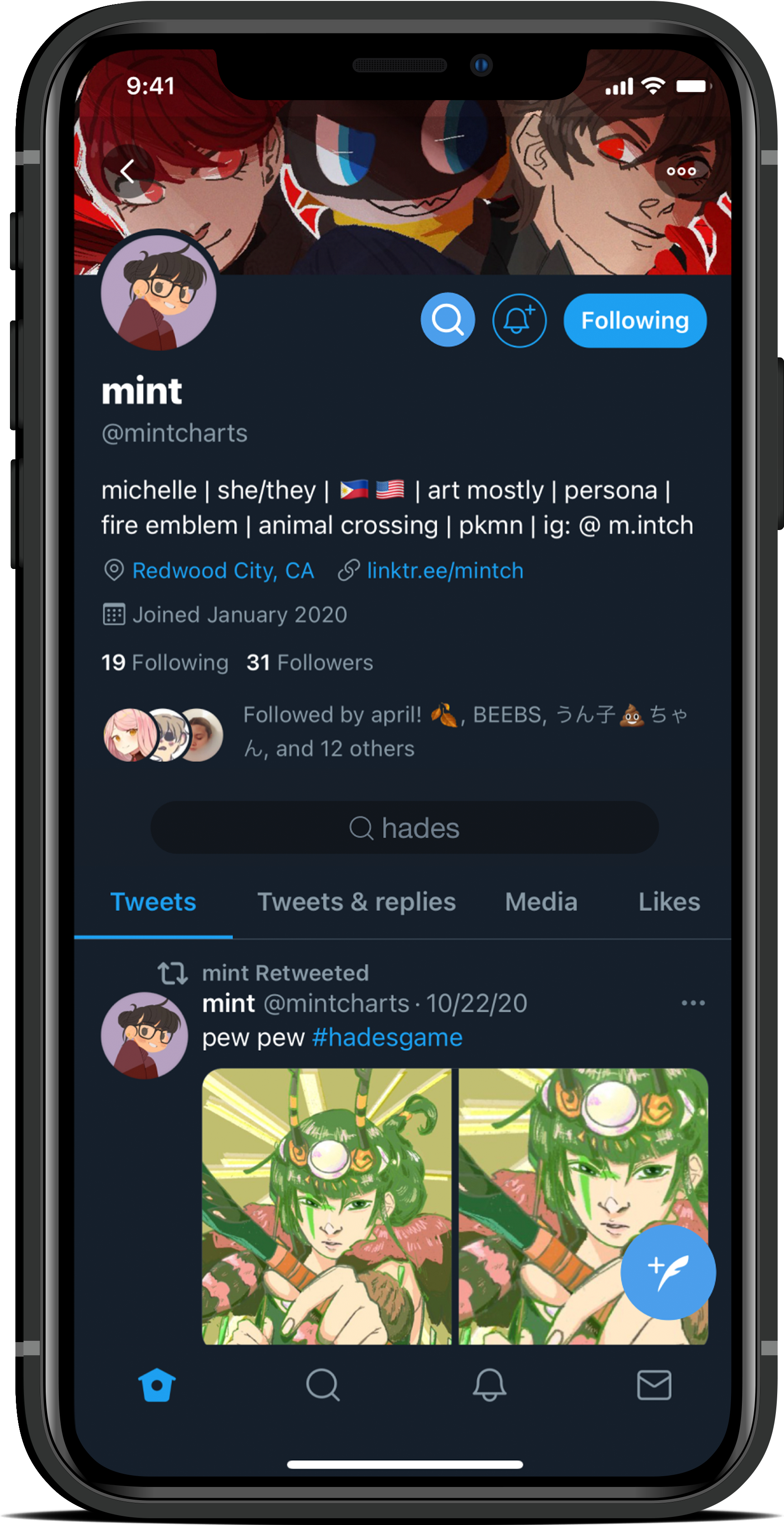
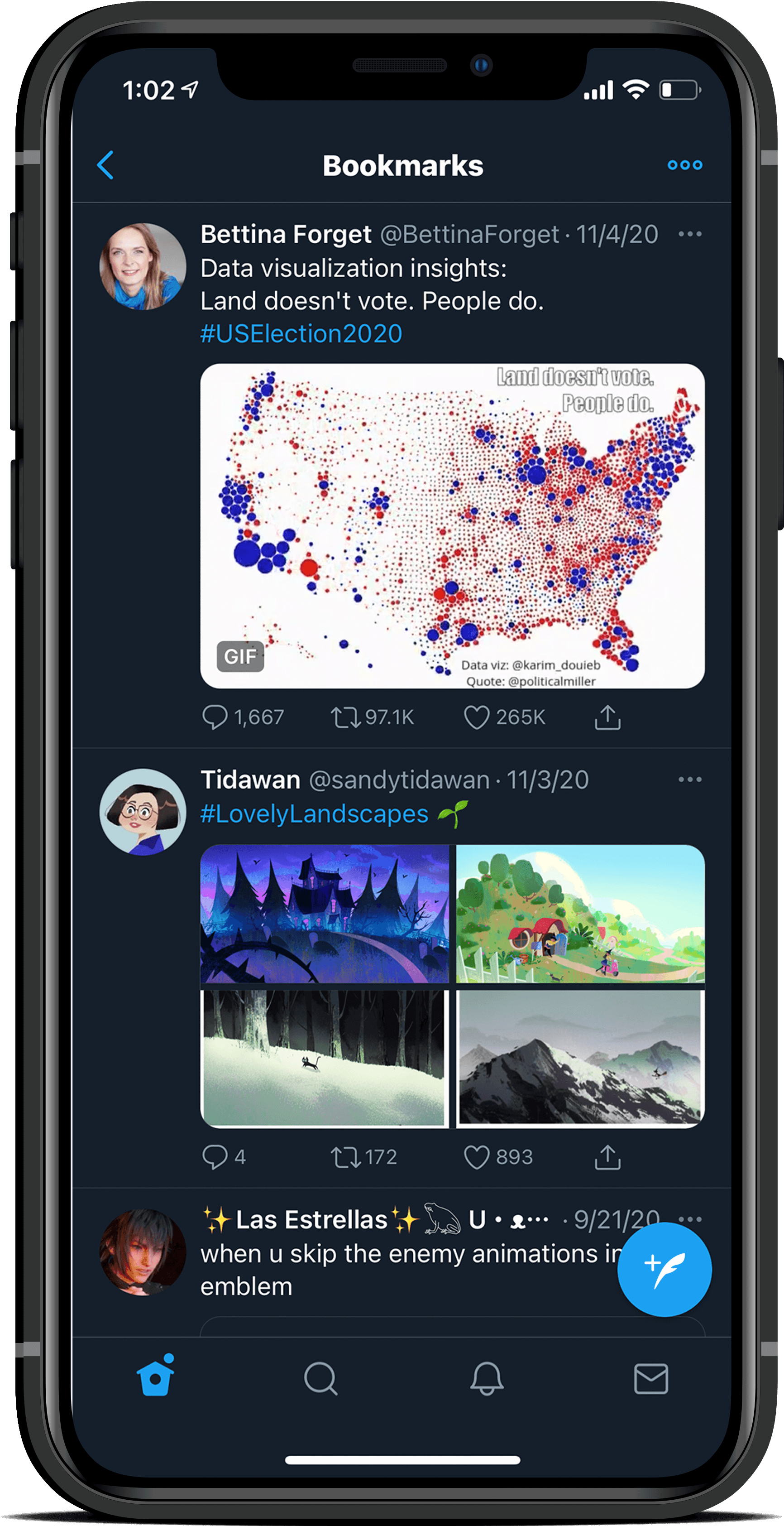
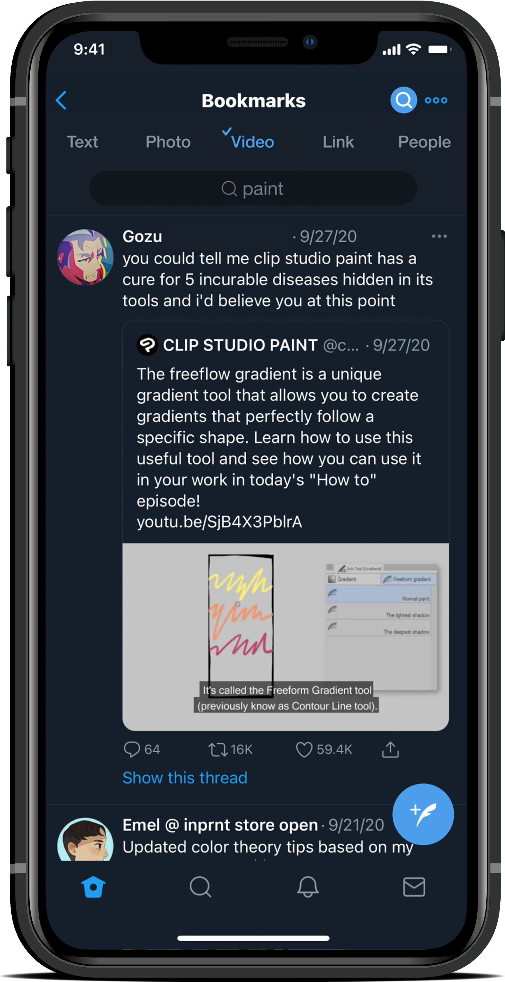
I generated a realistic prototype to bring my solution to life and get high-quality feedback from users with Figma. The prototype features three different areas I felt like searching on Twitter could be improved: the search section, the profile, and the Bookmarks section.
Try out my prototype here!This YouTube video presents a click-through of my Webtoon Figma Prototype, displaying all the screens created to bring this idea to life.


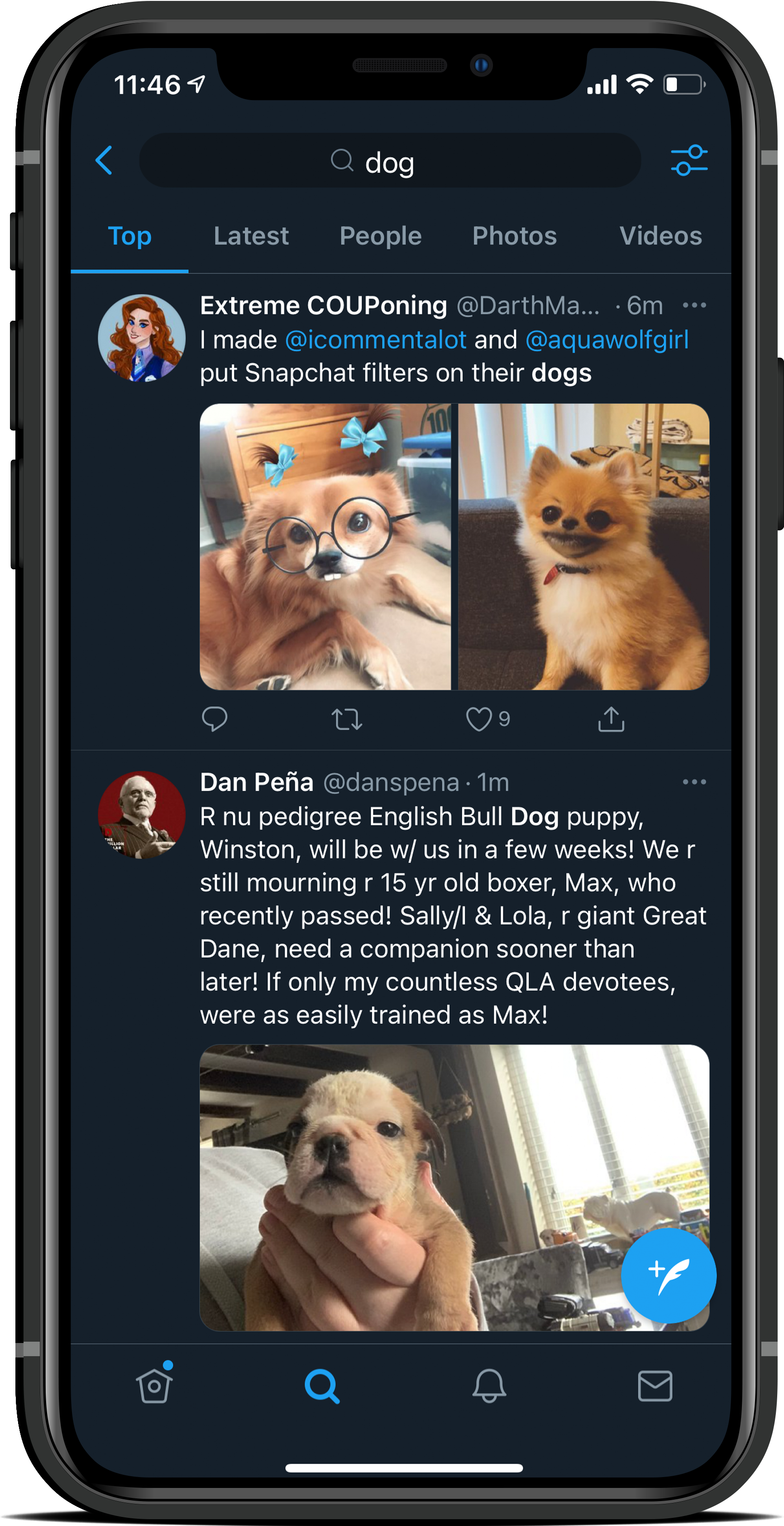
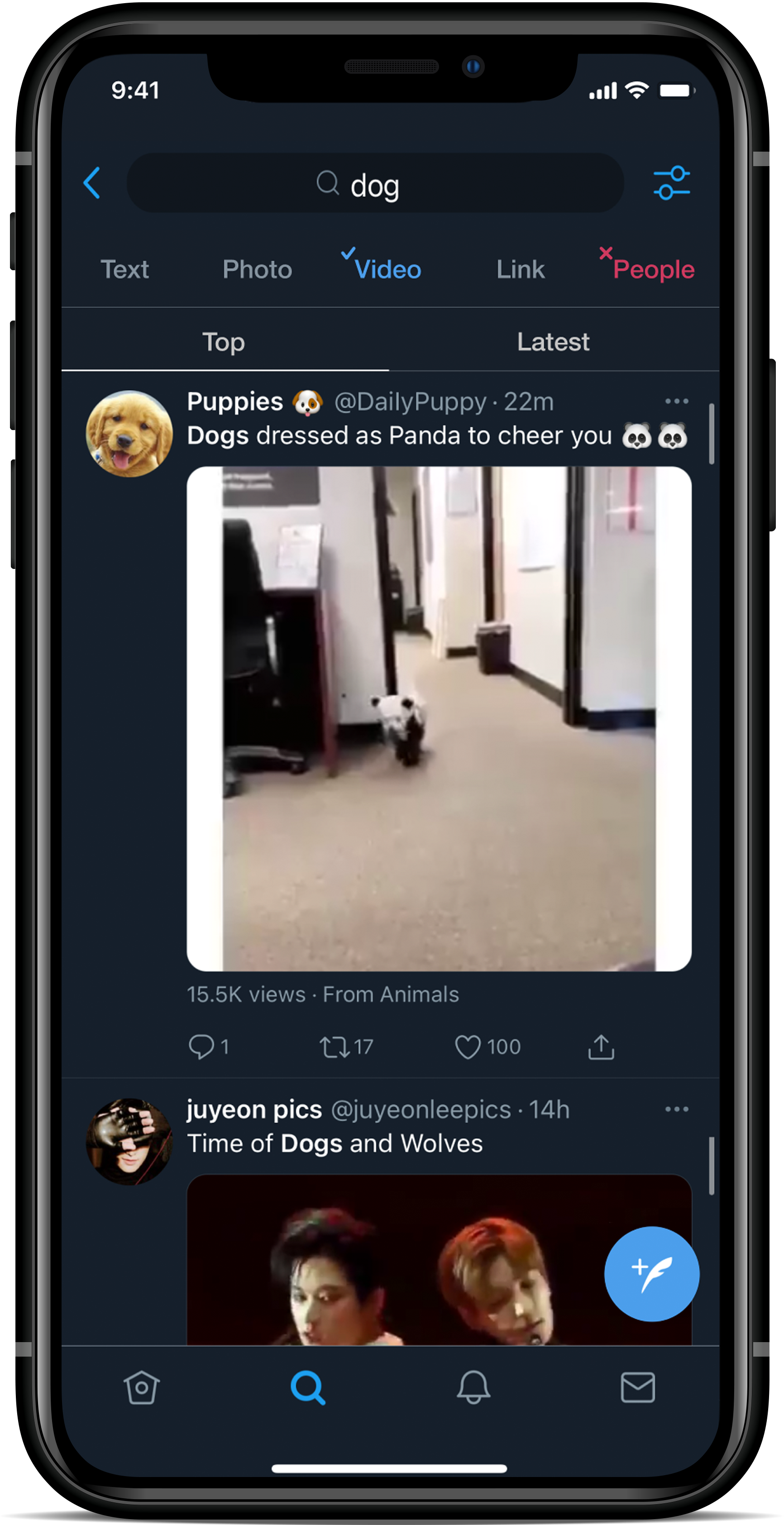
What changed: The search filters have a more interactive flair, allowing users to decide what they want to see better; posts can be toggled by top or recent.


What changed: by adding a search button to profiles, users can search directly on any profile using keywords and filtering with the tabs Twitter profiles already contain (Tweets, Tweets & replies, etc).


What changed: Bookmarks' functionality improved greatly, enabling search similar to profiles and the search tab. Users can search by keyword, and filter by post type or people.
I identified target users through my personal contacts and assembled a research script to ensure I got high-quality & unbiased feedback. Interviews were about 45-60 minutes long via video call.
Each user was given the task of going through the motions of searching for a Tweet they wanted to share with a friend.
While I had to guide my users through the process of discovering the profile and Bookmarks screens for new features, all of the users I interviewed were impressed with the changes made to the search tab. One user stated, "This layout seems easier to use than using Twitter's advanced search for sure."
User Testing & Evaluating
Key Takeaways
After completing interviews, I revisited my notes to find large patterns and inform next steps.

Some users remarked that the search filters did not work the way they initially thought.

For my next iteration, I will make the "checkmark" filter only show the indicated field (i.e. if "Photo" is checkmarked, only Photos will show up in search results).

The most valued search experience change was to the Bookmarks tab.
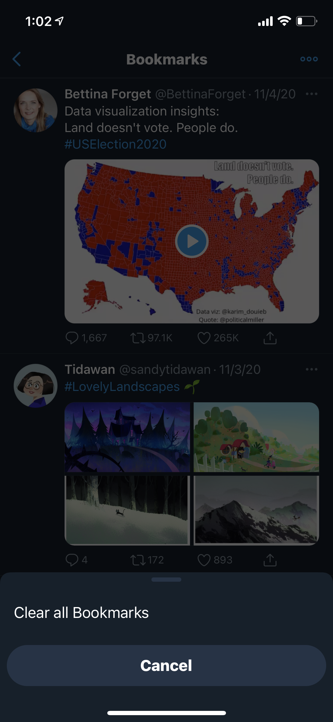
Many of my users were shocked to discover that, currently on Twitter, the only feature you can do in Bookmarks is to erase them. They were thrilled to see my change, which utilizes the list better.

Working with Twitter's existing features made the redesigns appear familiar and trustworthy.

By replicating Twitter's own search bar and using Twitter-esque elements across the three screens I changed, users were quick to understand what each function did and how to use it.


